Saturday, 6 April 2013

Finishing the second page of my paper

This is what my second page looks like at the moment. I have added the 'contents' section and it includes all the sections of my paper and draws a link between the paper an the online version. I am going to add stories and images to the page while making sure that I stick with the house style of the paper. I am still unsure about keeping the small editors section at the top of the page, I am begining to think that it makes it look more like a magazine, not a paper.

I have removed editors comments at the top of the page and have added the story about 'Elliot floods the Engine Room'. I am not sure about the position of the story but once I get more of the content on the page I will be able to sort out the positioning of the stories and make the page flow and easy to read.


I decided to move to story about 'Elliot' to a different area on the page. I chose to put the 'Free Degree at College' story at the top of the page as it is almost a contradiction of the story on the front page. The Government are cutting funding for Universitiy students, but they have the money to start 14 new degree programs and not charge any fee for the first year on all of the courses and on some of them no fees on the second year. I think that this
story is much more important than 'Elliot' although that story will be on the bottom of the page. I do plan to add some pictures to this story, I just have not taken them yet.

I have now chosen to add the story about 'Elliot' at the bottom of the page and I have also added an appeal for wittiness's following a fight at a Laxey Football match on the front page and this is because it is a community page and someone may have seen something and may wish to report it, that is one of the things I noticed in other local papers that I analysed especially in the Lancashire Evening Post.
I have left a space under the 'Free Degree at College' story for images but over all I am happy with the layout of the page and I think that the red line singling out the big story carries on the house style that was set on the front page and I think that it works well.

I have decided to change the layout of the page slightly, originally I was going to insert a copy of the college logo.
However after a bit more thinking I decided that inserting the logo would be a bad idea as logo's are generally associated with advertising, I am not advertising the college I am publishing a story about it an as such I have taken my own image of the front of the college which I have used on the page instead and it looks much more professional. I have inserted both so you can compare the difference.

I have changed the layout of the 'Free degree at college' story and have added an advert for 'JAR' at the bottom of the page which is a local night club and this symbol with be recognizable to many of my readers as it is a well known place and many of them would go there at the weekend.


My Advertisement.

I have decided to create a billboard poster for my paper. I am going to stick with the house style of the paper which is red, black, white and grey as I feel that in order to put the papers style across I have to base the advert to look like the paper otherwise people will have no idea what is going on.

This was the first idea I had for the advert, putting the logo in the middle of the page, it is only now that I have realized that this logo is still not bold enough and that something needs to be done about this.


I decided to change the papers logo, I understand that at this stage in the game it is really late to be doing this but at the same time the logo is something that is really important and it is something that needs to be right.

Using Microsoft Publisher 2007 I found a font that makes a statement called 'Engravers MT' and put the text size at 170 for the 'I' and 150 for the 'P' this is mainly because on this font the 'P' is much broader than the 'I' and I don't want the 'P' to be the dominant letter within the logo as they both need to be equal. Originally I did have the smaller text at the side of the letters in 'Engravers MT' but this did not work for me as this font only writes in capital letters and it made the logo look unprofessional and almost aggressive. My paper is aimed at 16-25 year old's who are used to abbreviated English or 'text talk' and usually when you receive a text message in capital letters it means that the sender is shouting, and I do not want this put across in my paper so I chose to go for 'Times New Roman' at the text size of 26 and at the moment I have chosen to keep the big letters is red and the smaller ones in black to add contrast and make the logo stand out.

I can see the difference and the second logo stands out much more and is much more exciting than the first one. I am going to put the new logo on everything, which will help me double check that everything on my paper and website is where it should be and everything is finished that needs to be.


This is my new logo in the center of the page, I now plan to put the papers logo underneath the logo and then a release date running across the top. Although this is a simple enough layout it is eye catching and it is also linked with the house style of the paper so that a link can be made between the advert and the paper.


I have chosen the font called 'Segoe UI Light' from 'paint 2007' it is size 36 and I think that is looks clear, crisp and very professional, so far.


This is me putting the final piece of text on to the advert, however now that I am looking at it nearly complete I keep thinking that it is a bit bare looking and that maybe I should include some other images. Or at least look at some other billboard signs for some inspiration.


 I typed into 'Google Images' 'billboard signs of advertisements' and these are two of the adverts that came up besides adverts for renting billboard space. These are both really simplistic adverts really do say a lot, I understand that both of these are well known brands the top on is a 'Pepsi' advert and the bottom one is a 'Walkers' advert. However the 'Pepsi' advert does not even have its name on it, it has there logo that is used on all of there products. This is a house style that is so well known you instantly register it, at least in the western world.
However both of these adverts are simplistic and they deliver a strong message about the product. This is very similar to my advert, with the less is more approach. However I may add the newspapers website address, so that people can have a look before the first paper copy is released.


I have added the website on to the bottom of the page and I think that the advert looks really clean cut and professional and it is not over crowded.


This is my finished Billboard Advert for my paper.

I have just noticed that there is a word on the advert spelled incorrectly 'Febrauary',  so I have changed it so that now all the advert is all correct. 


Thursday, 21 March 2013

The Second page of my newspaper

The first thing I did was make a box the exact same size as the page and change to the publisher colour 'RGB (248, 248, 248)' and then put it at the side of the page. This is so that the second page is the same colour as the first page and also so that I can use the guide lines on the page to place everything and then add the box to the back to change the colour.


I have now added the title 'This weeks stories...' running across the top of the page, however I feel that this is not the layout the I feel is appropriate for my target audience. I feel that by using a title like that at the top of the page I am appealing to a more basic audience that would more enjoy a magazine based publication were things are laid out in a basic formation and there are swarms of pictures surrounding a basic amount of text. I have chosen to completely discredit this idea and instead use a similar concept that I saw in the local paper I analysed at the start of my project called 'Longridge & Ribble Valley News and Advertiser'

The idea of a 'contents' in a paper is very smart, especially a local paper as some individuals may just want a specific section of the paper, such as the classifieds and not want to read anything else and this could help them find them. The fact that they have incorporated their website into the bottom of this 'contents' is something very exciting as well, showing a strong link between the newspaper in paper form and the website.

 This is an idea that I plan to use in my paper as a simple way to monitor the stories and the sections that are going into the paper and to try and increase the fact that there is an online presence for the paper within the hard copy as a subtle reminder to readers.


This is my first attempt and I think that they layout of it is actually really good, I like the fact that I have chosen to center the word 'Inside' the the subheading box as it is makes it stand out against the red box which fits with the papers house style and colour scheme. The grey arrow shape at the end of the page looks quiet professional and breaks up the colour so it is not a big block of red about a lot of white text.

 However the only thing that I am not happy about and that I think looks messy is the dots between the section title and the page numbers. I just think that '.......' between words looks messy accept when it is used for a grammatical purpose.


I think that the second screen shot of the 'Inside' section of my contents page is much better because it does not have lots of random dots between the words and the numbers. I have made sure that the second image still looks neat by keeping the last number of all the page numbers in line as well as keeping them all in the same front and the same text size. The font is 'Times New Roman' and the front size is '14'


I have now added 5 more subheadings to my 'contents' page including

  • Homes
  • Jobs
  • Classifieds 
  • Announcements
  • Business

Jobs

The job centers logo
I have chosen to put them all if different colours (although some will not be staying that colour) so that they stand out more and I have tried to link the colours to the word in some way, such as the 'Job Center' in the Isle of Man which is obviously were the majority of jobs advertised on the job page will come from has a purple logo. 
Others I will change the colour of like the business and the Announcements to a colour that is more appropriate when I begin adding in all of the page numbers and details underneath. 


I have added page numbers under the 'jobs' subheading and that is the only thing that really does need to be added under that section as 'All Job Advertisements' is pretty self explanatory. There are two reasons why I have included a 'Jobs' section in my paper; 
  •  It is first and foremost a local paper and this information is something that the public will be interested in if they are looking for work and as a paper it needs to meet the demands of the readers. 
  • The target audience for my paper is 16- 25 year old's,  what the government class as 'Youth'. There is mass unemployment within the ages of 16-25 which is another reason I thought it would be a good idea to include this in the paper as it gives people who are leaving school and people who are unemployed the chance to gain access to job vacancies. 

Homes

I have now added the section 'Homes' which is a considerably long section of the paper, so as of yet I am unsure whether or not to make it a pull out. I have decided to include all property whether it is a house, a flat, a bedsit anything at all within the property market as well as any property up for sale or rent and I think that this is a good idea. I do realize that not all of my target audience can afford to buy a property but there may be a small amount of people who can. This is why I have decided to include flats and bedsits that are available to rent. This is a way to allow the readers to access information that they need in the same place. The information for job vacancies and the information about property available for renting/buying is something people will find useful, especially when it is all in the same place. 


I changed the colour of this subheading to green and the simple reason for this being that are local real estate agents 'Heritage Homes' which is owned by 'Dandara' has a logo that is green  So many local people will associate the local real-estate market with the colour green, well I hope so. 


Business

In the 'Business' section to the paper I have added 3 different sections;
  • The Manx Economy
  • Manx to the Max
  • Business Strategy 
The reason I have decided to add a business section is that this island is obsessed with business. The island could most propberly be classed as a tax haven compared to the UK so many business choose to set up offices here. There is a massive amount of Offshore Banking as well as E-gaming and online gambling. Due to the high level of business there has been a rise in the need for Accountants, Business executives, lawyers ect. This has had a massive influence on the education choice not only for Manx students but also on the 'Higher education pathways' that are offered by the Isle of Man Government. There is currently 7 Business based on island degrees and more due to be starting in 2014. Many young people are interested in business and that is why I have chosen to include a business section. 
  • The Manx Economy; is basically a weekly run down of everything to do with the economy and various government changes that are being made to Manx economy to make it better. 
  • Manx to the Max; is a short series of articles from different Manx business explaining various things about there business and explaining to people why it is best to stay local with various day to day activities such as food shopping, clothing shopping and recreational activities. 
  • Business strategy; is a main focus for the young people who are massively interested in business (believe me there are a lot of them). It is a different company every week explaining what they do to stay as local as possible, why they make various business decisions and what they do to benefit the island. There is a similar section to this in the 'Manx Independents Business Guide' and that is one reason why I chose to include it as part of my paper. It is something that people read and pay for and something that other business are going to be interested in so why not put it into the paper rather than into the free 'Business Guide'.
I have also changed the colour of this subheading to a dark blue, I think that this colour looks more formal and more serious and ties in with the theme of business on this section. 

Classifieds

I have chosen to have 3 different sections to the 'classifieds ' section of my paper. 
  • Motor
  • Furniture
  • Other
However now that I have seen these sections and realised how random they are I have decided to remove them and just have a summary of all classifieds available as well as the page numbers they are covering. 

The second image looks much better, it looks clear and professional. The Classifieds section its self would be split up into different sections to prevent any reader becoming confused so that is not a problem. 


Announcements

I have added a summary option for the announcements, I think it would be a bit depressing for a local paper to go into obituary's especially on the front page. So I have covered all announcements, but of course the section will be split into smaller subsections;
  • Weddings
  • Anniversaries
  • Birthdays
  • Obituary's
as well as any other section that might be needed. 
I have chosen to changed the colour from green because that is the colour  I am using for the 'Homes' subsection and because it really is an awful colour to have for 'Announcements'. I nice soft simple colour should be used and that is why I have chosen this shade of a light pink. I think that is goes with the word 'Announcements' quiet well and it is subtle and effective. 

The Finished Contents

This is the finished layout for the contents of my paper. I have changed the colour of the 'Classifieds section from a bright yellow to a darker green as the yellow really was too bright and made my eyes hurt from looking at it which is not something I would want for my readers. 
I am now going to add a small image above it of the editor and a summary of the online stories below it to make sure that people see the link to between the online and the paper version. 
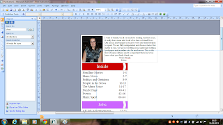
This is a screen shot of the editors thanks that I have produced for the space above my contents. I think that having thanks from the editor is something that is important, especially for a new newspaper. Although I am not happy with the actual paragraph I will come back to it later, I am working from college right now and they have blocked the website I am using to build my website so I can not get access to the summary I have written on the 'Contact Us' page. 

This is my top 5 stories from my website. I have put this here so readers can see the more in depth stories that we offer online and the different types of media tools that we use. This is something that is important as my paper is aimed at 16-26 year olds and needs to have a massive technology based presence. 


Friday, 8 March 2013

Other pages of my website.

This is my 'Contact us' page from my website. I have put in a short summary about what the concept behind 'Island Press' is and I have also included an option of leaving a message on the website with the 'Please get in touch' section of the contact us as well as the contact details such as address and phone/fax numbers as well.

Now I think about it, most of the stories that I have so far on my website have been accompanied by a link to contact us with a quote above it saying email. I think that in this case I am going to put the 'Please get in touch' option above the contact details and the idea of this paper is to have a massive online presence and that is the reason I decided to do this because the current Manx papers barely have any online presence. 

After switching those two sections around I think that page looks much better. 
I have added the 'why us?' section is because it is important that people know this is a fully independent paper.  
I have put an image of myself as the editor of the paper so that people know who I am and can know a bit about why I started the paper.
This is the image I used and it was taken of me at an awards evening.


Events page

I have added some events in the similar shape to a calendar to the 'Events' page of my website. I have added them though out the whole moth of March, every weekend there is something different. 


Underneath the local bands I have put the 'Jupiter' events that I have been talking about on the headline page. As well as that I have included some 'Dance Events' I understand that there will be a varied audience and that dance music is very popular and usually all the dance nights are at the end of the month, usually after pay day, which in this case they are. 

I have decided that for now I am not going to put any reviews on  the events page as I think it looks clean cut and professional like that. So I am going to put the article I wrote about 'Jupiter' on the headline page of the website and then link it to the events page. 


A Whole new website

Due to the crashing of the website I was using my website has been lost so I am having to create a new one. This is not going to be as much work as I originally thought because all my stories were saved in 'Microsoft Word 2007 Documents' and all my pictures are on my computer. This means I can take a fresh perspective on the layout of the site and change a lot of things about it and the layout.

This is what the site looks like before I have done anything to it. Obviously the colour scheme, the layout and the page links need to be changed.


I have now changed the colour scheme so that it is red, I thought the slightly darker red on the background look professional and the slightly lighter red for the linked pages made it stand out more. I have also inserted the name of the paper and the logo. 


I have put on two slide shows of the images that I have used on the front cover of my paper and then the images that I will be using on the events page. 
I have put the images from the front cover in order of there importance. So the main story comes first followed by the others right down to smallest article on the front page. 


I have also created hyperlinks on the page were by clicking the button underneath either the headlines or the events it will take you straight to the page were you can get all the information on that page. 


I have chosen different fonts for 'headlines' and 'events' for a specific reason. 'Headlines' are something that is very formal and very important to many of the readers so that need to look modern and professional. The 'events' is something that people read/attend for pleasure and since most of them are rock or dance concerts then it needs to look modern and attract peoples attention through the modern layout. 

I have now added the summary under the name of the title just to say exactly what the website is for. This time I have also added the advert for downloading the paper 'app'. I think that this is a good idea as if people are checking online on their mobile phones having an app would make it easier for them. So I think that it is a good idea to put the advert at the top of the home page. 

Headline page


I have entered my first story 'Tynwald say YES, now we pay fees' using the image that I used on my front cover. I have also written a full story about what has happened and used quotes from people and explained in full the legislation that has been passed as well as trying to look at the impact that it will have on the students. 
At the end of the article there are two boxes that have been hyper linked. The one called 'DEPARTMENT OF EDUCATION AND CHILDREN WEBSITE' is linked to their website www.gov.im/education with a short paragraph above saying;
We are currently waiting for the new legislation to be published, you should be able to find it by clicking the button below.


The second hyper linked box is called 'CONTACT US' which I have put on there because the webpage will not allow me to put a Facebook comment box and a twitter box on the same page, so I have gone for the more popular social networking site with a short summary above it saying;
Leave you comments by posting via the Facebook comment box below or following us on Twitter or emailing us. Find all the details on our contact page. 

The reason both the boxes are in capital letters is because that is the only option however I do think that it makes them stand out more as well as the red that I have chosen for the colour of the boxes.

This is the second story that I have put onto my headline page 'To young to drive?'. Again at the bottom of the story I have put a hyper-linked box to the papers contact details, and  I have put a Facebook comment box underneath the story so that readers are able to have there say.
This is the image that I have used for the front image on the paper, and for the story on the website. I am still planning to take my own image and replace the one that is on the front cover and the one on the website.


This is the third story that I have put on the website 'The benefit system is ridiculous'. The image that I have used is of a 19 year Portuguese man that I know and I used an image of him in a suit to give the impression that he is smart and presentable and was only using the benefit system during a time that he really needed it as I know that stories about benefits are incredibly controversial. I have also asked for people comments at the end of the story and I have inserted a hyper linked button to the contact details and then underneath that button I have put in another Facebook comment box for people to post there opinions. 


This is the fourth story that I have put on the headline page 'Flames have taken everything'. At the end of this story I have included the number for crimestoppers, as in the story I have written that it is still an open investigation and any one who saw anything could see the article and aid in the investigation. I have also included a facebook comment box and above the box I have written;

If you want to comment on this story or show your support for Mr and Mrs Smith post on our Facebook or Twitter page.


This is the image of Mr and Mrs Smith that I have used, I thought it would be much more appropriate then using one of a burnt down house that could cause some upset.


This is the fifth story that I have put onto my headline page, 'Sponsored shave for Macmillan'. My friend recently shaved her hair for Macmillan Cancer Support so I thought that this would be an excellent story to include in my paper as it is a community based story and shows what people within the community can do to help.

I chose to use two images for this story so that people could see her hair being shaved off, and then her without any hair. I thought that this would be really effective and it makes the story seem more realistic because the readers can see what she actually did.

I also chose to put a hyper-linked button straight to the Macmillan Cancer Support home page under this story. This is so people will be more inclined to make a donation or even to find out more about them as a charity. I have also included a Facebook comment box so that people can comment on the story, however I have not put the hyper-linked box to the papers contact details because for this story I do not feel that they are necessary because there is nothing that people would really want to contact the paper about. That is why I have chosen to put the link to the Macmillan Cancer Support instead.


This is my sixth story on the headline page '19 year old comic book prodigy' I have written a short article about the writer and his success in both the UK and the USA. I have also included a slide show of some short comic book scripts that I created for this.


This is the seventh and last story I have included on my headline page 'Jupiter rocks our planet for the weekend'. I have written a small summary article as there is a much larger article on my events page. I have put a hyper-linked box underneath the summary article straight to my events page. There is no need to include a contact us box as there has not been anything to really require readers to contact us and in the article on the events page there are details of how they can buy tickets for the concerts and details of the charity events. This is also the reason that I have not included a Facebook comment box.  The image above is the image that I have chosen to include on the front cover of the paper and on the headline page of my website.